LinkedIn Content Analytics
▶ Data-flow diagram — self-contained HTML, opens in a browser — no install, no build
Situation
One workbook, exported by hand from LinkedIn, is the only source of truth about how my content performs. The question is not «how many impressions did I get» but «which format to write next — and is the difference even established».
A ranking whose confidence interval covers the whole field is not an answer: showing it as one is worse than showing nothing.
Task
I needed a report that ranks formats only where the difference is established, and honestly calls noise noise. Plus the same numbers across every output format.
Actions
One core — four renderers
The same workbook used to be parsed twice — in the vault and in the project — and the parsers drifted: the vault joined posts by URL, the project by date. On 13.09.2026 two posts fell on one day, and the date join silently collapsed them into one: 48 paired posts instead of the correct 49, a top share of 93.7% instead of 97%. Nothing turned red.
Now the core is single (linkedin_analytics_core), and a test holds the invariant: the markdown report, the HTML dashboard, the SVG chart for the README and the vault note all emit the same numbers.
Statistical standard
- Resample posts, not impressions. Impressions are deterministic once a post is chosen; only which posts got written varies.
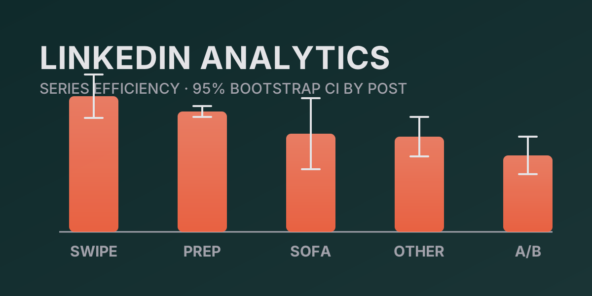
- Intervals, not points. n is small, so a 95% percentile bootstrap over posts sits next to every series.
- Overlapping intervals are called overlapping. Most of the series ranking is inside the noise, and the report has to say so.
- An empty result is a result. Original vs repost (p = 0.60) and weekday rhythm (p = 0.060) are not hidden.
- A quantity that cannot vary is not a metric. The top share was removed.
Run
./run.sh --analytics-only --dry-run   # preview, content analytics only
./run.sh --apply                      # reports + note edit
Result
Window 12.10.2025 — 11.10.2026:
| Metric | Value |
|---|---|
| Impressions | 50,101 |
| Members reached | 9,440 |
| Engagements | 859 |
| Engagement rate | 1.71% |
| New followers | 2,175 |
- Series. Swipe 22.9 [18.8, 26.2] and Interview prep 20.3 [19.6, 21.4] do not overlap A/B & stats 12.9 [9.9, 16.3] — the difference is established. Sofa analytics 16.6 [11.6, 23.6] overlaps all of them: there is nothing to say.
- Original vs repost. 16.9 vs 19.4, p = 0.60 — no difference established.
- Weekday rhythm. Mon 23.1, Sun 12.6, p = 0.060 — the threshold is not cleared, still a hypothesis.
- Impressions vs followers. r = 0.35, 95% CI [−0.15, 0.72] — the interval contains zero; followers are not a measure of a post’s success.
Limitations
Series hold 3–8 posts each and weekly buckets 6–9: at that n a narrow interval almost certainly means lucky posts landed in the sample, not that a format is genuinely better. The README deliberately omits audience demographics (companies, cities, roles) — they stay in the report and dashboard. The unsubscribe count (~81) is inferred: the workbook carries no direct figure.
Documentation
- GitHub → linkedin-nikita-boyarkin — private repository